Visualizing FDA Data
In this example we use the openFDA API to get information about drug side effects. We want to compare side effects between different drugs. We will show 4 different graphs.
Few categories (compare 2 or 3 drugs)
- Few items (compare 3 drugs for 2 side effects) create a column chart
- Many items (compare 2 drugs for many side effects) create a bar chart
Many categories
- In this example we will create a table of embedded charts to compare side effects between many drugs
- We use a variable width column chart to compare side effects between a few drugs (4 or 5)
Many categories, many items
- In this example we will use a 3D bar chart to compare many side effects between many drugs
Objectives
- use an API to retrieve data
- define small functions that we can re-use
- select the appropriate chart depending on how many items and categories we have
- use matplotlib to create the charts
As usual we import libraries that we will use and we tell the notebook to create the plots inline.
import json as js
import urllib2 as ulib
import simplejson
import matplotlib.pyplot as plt
import numpy as np
from operator import itemgetter

%matplotlib inline
Now we use the openFDA api to get drug data.
- First we define a request string following the documentation on the openFDA site (https://open.fda.gov/api/reference/). Note that most of the request string is static. However the drugname is passed in as a parameter.
- We use urlib2 to open the url and get the response
- We use simplejson to load the response as a json object.
# form a request
request_string='http://api.fda.gov/drug/event.json?search=patient.drug.medicinalproduct:aspirin&count=patient.reaction.reactionmeddrapt.exact'

response=ulib.urlopen(request_string)

# load as json
fda_data=simplejson.load(response)
It is useful to take a look at the type of the result.
print type(fda_data)
<type 'dict'>
It should be a dictionary. So it will also be useful to take a look at the keys
for key, value in fda_data.iteritems():
    print key
meta
results
It appears we have meta-data and results. Retrieve results and print out the type
print type(fda_data['results'])
<type 'list'>
It's a list so lets take a look at the type of and value of the first item in the list.
print "type of first item: "+str(type(fda_data['results'][0]))+" value of first item: "+str(fda_data['results'][0])
type of first item: <type 'dict'> value of first item: {'count': 9470, 'term': 'FLUSHING'}
Each item in the list is a dictionary containing a 'count' (number of adverse events) and a 'term' (name of adverse event). Let's print out the first 5 values of the list. This is done to get a better feel for the data. For example what type of symptoms do we find in the list? (if you are following along interactively try printing out more than 5 values to get a better look at the data).
fda_list=fda_data['results']

for x in range(0, min(15, len(fda_list))):
    entry=fda_list[x]
    print 'term: '+str(entry['term'])+" count "+str(entry['count'])
term: FLUSHING count 9470
term: NAUSEA count 8382
term: DYSPNOEA count 8189
term: DIZZINESS count 7654
term: FATIGUE count 6577
term: ASTHENIA count 5903
term: MYOCARDIAL INFARCTION count 5742
term: DIARRHOEA count 5736
term: PRURITUS count 5540
term: HEADACHE count 5429
term: CHEST PAIN count 5172
term: DRUG INEFFECTIVE count 5136
term: VOMITING count 5134
term: PAIN count 5078
term: FALL count 4941
Now that we know a little bit about our data we put that knowledge to use by writing a function that we can re-use. The function forms a request string using a 'drugname' that is passed in as a variable. It then opens the url and uses simplejson to load the response. We return only the 'results' part (remember this is a list of dictionary data representing adverse events).
def get_drug_adverse_event_data(drugname):
    # form a request
    request_string='http://api.fda.gov/drug/event.json?search=patient.drug.medicinalproduct:'+drugname+'&count=patient.reaction.reactionmeddrapt.exact'

    response=ulib.urlopen(request_string)

    # load as json
    fda_data=simplejson.load(response)

    # return the results
    return fda_data['results']
We also define a function that will return the event count for an adverse event. To determine the adverse event count we need to retrieve the count for a specific term (remember term is the name of the adverse event). We end up using an itemgetter to retrieve a list of terms. Then we find the index where the term of interest is located. Then we use the index to get the count. This is all done concisely in a couple of lines of code. The commented out section is a scratch pad where we experimented with the components that we used to write get_event_count.
'''temp1=itemgetter('term')
print type(temp1)

temp2=map(temp1, fda_list)
print type(temp2)
print temp2

temp3=temp2.index('FATIGUE')
print temp3

count=fda_list[temp3].get('count')
print count'''

def get_event_count(event_list, event):
    try:
        index=map(itemgetter('term'), event_list).index(event)
        return event_list[index].get('count')
    except ValueError:
        return 0
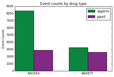
So now that we have a function that returns a list of adverse events for a specific drug let's use it to get information about two different drugs.
drugname1='aspirin'
drugname2='paxil'

druglist1=get_drug_adverse_event_data(drugname1)
druglist2=get_drug_adverse_event_data(drugname2)
Next, use the 'get_event_count' function to get adverse event accounts for two different types of events. We print out the two lists to make sure the data is in the form we expect. Each list should contain 2 event counts (2 integers)
event1='NAUSEA'
event2='ANXIETY'

aspirin_list=[get_event_count(druglist1, event1), get_event_count(druglist1, event2)]
paxil_list=[get_event_count(druglist2, event1), get_event_count(druglist2, event2)]

print aspirin_list
print paxil_list
[8382, 3267]
[2897, 2605]
Now that we've read the data we can plot it. We follow this reference: http://matplotlib.org/examples/api/barchart_demo.html. The first step is to define the horizontal indices for the plots. It's useful to define this as a numpy array so we can perform calculations with it. We define a width that will be used for later calculations. We also get a reference to the axis which is used to place labels and ticks.
We use plyplot.bar to draw the plots. We pass in indexes to plot at, values to plot, width of the bars and the color. Note that in the second call we add width to the index. Since ind was defined as a numpy array we can perform mathematical operations on it.
Finally we add labels, a title, ticks and a legend then show the plot.
color1='#0a8641'
color2='#812983'

ind=np.asarray([1,2])
width = 0.35
fig, ax = plt.subplots()

rects1 = plt.bar(ind, aspirin_list, width, color=color1)
rects2 = plt.bar(ind+width, paxil_list, width, color=color2)

ax.set_ylabel('Event Counts')
ax.set_title('Event counts by drug type')

ax.set_xticks(ind+width)
ax.set_xticklabels( (event1, event2) )

ax.legend( (rects1[0], rects2[0]), (drugname1, drugname2) )

plt.show()
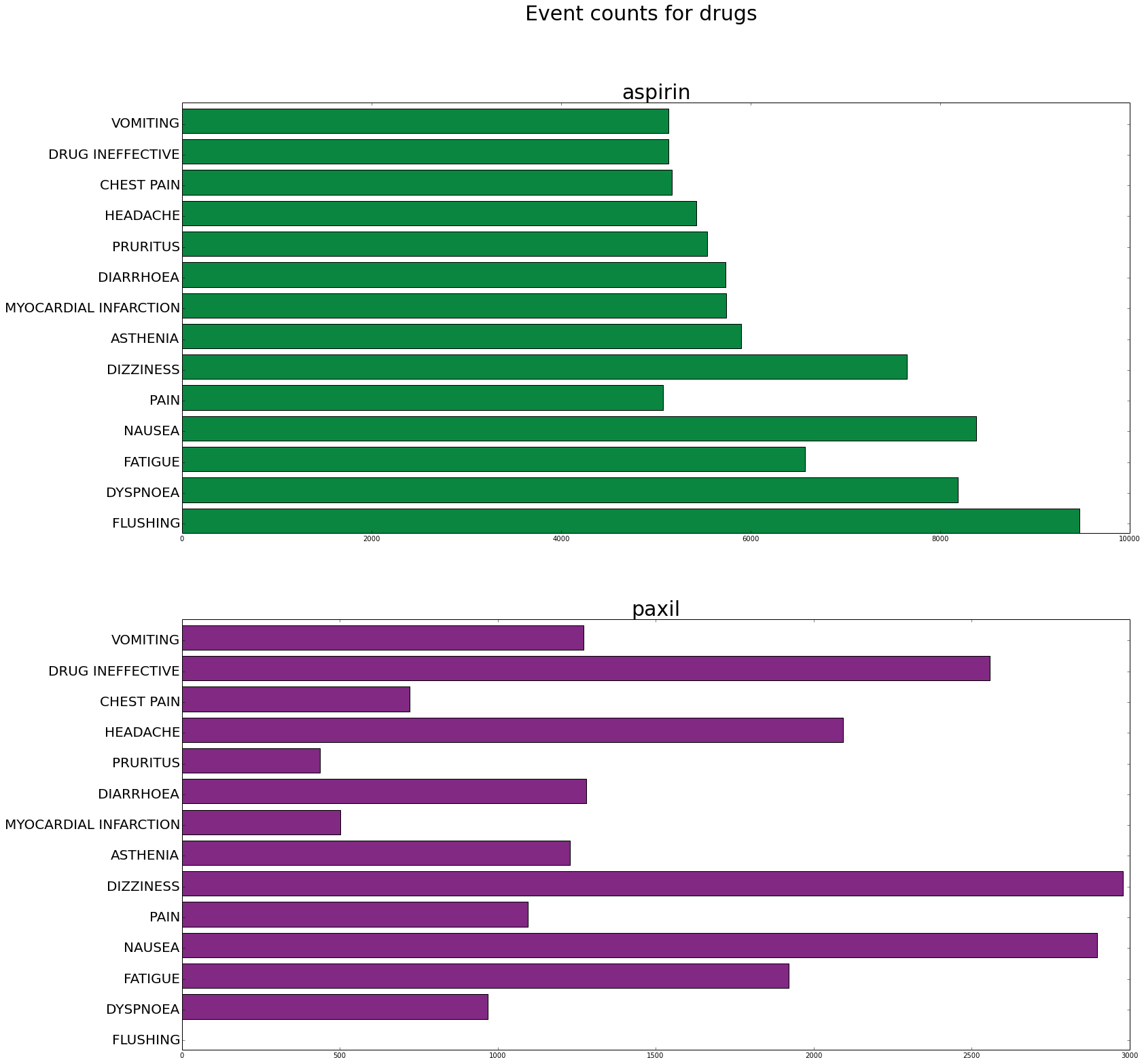
When we have only a couple of categories but many items per category a horizontal bar plot can be useful. This example shows a plot that compares 2 drugs for many side effects.
events=['FLUSHING', 'DYSPNOEA', 'FATIGUE', 'NAUSEA', 'PAIN', 'DIZZINESS', 'ASTHENIA', 'MYOCARDIAL INFARCTION', 'DIARRHOEA', 'PRURITUS', 'HEADACHE', 'CHEST PAIN', 'DRUG INEFFECTIVE', 'VOMITING']

#DYSPNOEA, DIZZINESS, FATIGUE, ASTHENIA, MYOCARDIAL INFARCTION, DIARRHOEA, PRURITUS, HEADACHE, CHEST PAIN, DRUG INEFFECTIVE, VOMITING, PAIN, FALL

count1=[]
count2=[]

for event in events:
    count1.append(get_event_count(druglist1, event))
    count2.append(get_event_count(druglist2, event))

ind=np.arange(len(count1))

fig, axes = plt.subplots(nrows=2, ncols=1, figsize=(25,25))

axes[0].barh(ind, count1, color=color1)
axes[0].set_yticks(ind+.3)
axes[0].set_yticklabels(events, fontsize=20)
axes[0].set_title(drugname1, fontsize=30)

axes[1].barh(ind, count2, color=color2)
axes[1].set_yticks(ind+.3)
axes[1].set_yticklabels(events, fontsize=20)
axes[1].set_title(drugname2, fontsize=30)

plt.suptitle('Event counts for drugs', fontsize=30)

plt.show()
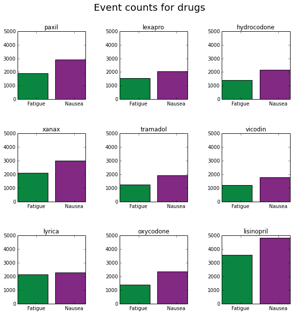
This example shows a table with embedded charts to compare many drugs for 2 side effects
event1='FATIGUE'
event2='NAUSEA'

ind=np.asarray([1,2])

drugs=['paxil', 'lexapro', 'hydrocodone', 'xanax', 'tramadol', 'vicodin', 'lyrica', 'oxycodone', 'lisinopril']

plotpos=[331, 332, 333, 334, 335, 336, 337, 338, 339]

fig, axes = plt.subplots(nrows=3, ncols=3, figsize=(25,25))

for drug, pos in zip(drugs,plotpos):
    druglist=get_drug_adverse_event_data(drug)
    counts=[get_event_count(druglist, event1), get_event_count(druglist, event2)]
    plt.subplot(pos)
    plt.bar(ind, counts, color=[color1, color2])
    ax=plt.gca()
    ax.set_xticks(ind+.5)
    ax.set_xticklabels(['Fatigue','Nausea'])
    ax.set_title(drug)
    plt.ylim([0,5000])


fig.set_size_inches(10,10)
plt.subplots_adjust(wspace=.5,hspace=.5)
plt.suptitle('Event counts for drugs', fontsize=20)
plt.show()
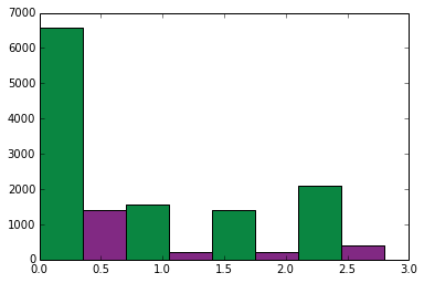
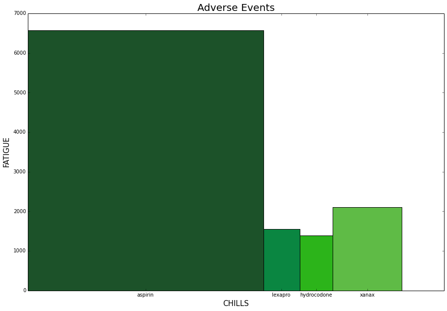
Another option when visualizing two variables between categories is the variable width collumn chart. This chart can be useful if the scale between the variables is different. First lets generate an ordinary collumn chart using one of the less common adverse events (chills).
event1='FATIGUE'
event2='CHILLS'

drugs=['aspirin', 'lexapro', 'hydrocodone', 'xanax']


width = 0.35
fig, ax = plt.subplots()

rects=[]

xc=0;

for drug in drugs:
    druglist=get_drug_adverse_event_data(drug)

    height1=get_event_count(druglist, event1)
    height2=get_event_count(druglist, event2)

    rect = plt.bar(xc, height1, width, color=color1)
    xc+=width
    rect = plt.bar(xc, height2, width, color=color2)
    xc+=width

plt.show()
An alternative is to use a variable width column chart which allows us to use all the axis space for each variable.
ind=np.asarray([1,2])

colors=['#1c5229', '#0a8641', '#2cb41a', '#5fbb46']

fig, axes = plt.subplots(figsize=(15,10))

pos=0
xticks=[]
current_tick=0

for drug, color in zip(drugs, colors):
    druglist=get_drug_adverse_event_data(drug)

    height=get_event_count(druglist, event1)
    width=get_event_count(druglist, event2)

    plt.bar(pos, height, width, color=color)

    current_tick=pos+width/2
    pos=pos+width

    xticks.append(current_tick)

axes.set_xticks(xticks)
axes.set_xticklabels(drugs)
axes.set_ylabel(event1, fontsize=15)
axes.set_xlabel(event2, fontsize=15)
plt.title('Adverse Events', fontsize=20)
plt.show()
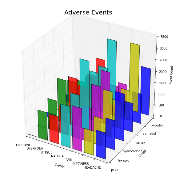
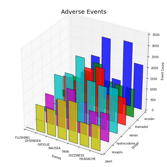
For many drugs and many events we can use a 3D bar plot based on http://matplotlib.org/mpl_toolkits/mplot3d/tutorial.html#bar-plots. Matplotlib has a 3d plotting extension 'mplot3d', which supports many type of 3D plots.
from mpl_toolkits.mplot3d import Axes3D

colors=['b','g','r', 'c', 'm', 'y']
drugs=['paxil', 'lexapro', 'hydrocodone', 'xanax', 'tramadol', 'vicodin']
events=['FLUSHING', 'DYSPNOEA', 'FATIGUE', 'NAUSEA', 'PAIN', 'DIZZINESS', 'HEADACHE']
positions=[50,40,30,20,10,0]
fig = plt.figure(figsize=(10,10))
ax = fig.add_subplot(111, projection='3d')
for c, drug, z in zip(colors, drugs, positions):
    xs = np.arange(len(events))
    ys = []
    druglist=get_drug_adverse_event_data(drug)

    for event in events:
        ys.append(get_event_count(druglist, event))

    ax.bar(xs, ys, zs=z, zdir='y', color=c, alpha=0.8)

ax.set_xticklabels(events)
ax.set_yticklabels(drugs)
ax.set_xlabel('Events')
ax.set_ylabel('Drugs')
ax.set_zlabel('Event Count')

plt.title('Adverse Events', fontsize=20)
plt.show()
It might also be useful to assign each symptom a unique color (instead of each drug). This can be done by passing in the entire array of colors each time we call bar. (Note that in both cases the code is almost the same. It would be good practice to write this as a function and pass in a variable that defines the colored axis).
from mpl_toolkits.mplot3d import Axes3D

colors=['b','g','r', 'c', 'm', 'y']
drugs=['paxil', 'lexapro', 'hydrocodone', 'xanax', 'tramadol', 'vicodin']
events=['FLUSHING', 'DYSPNOEA', 'FATIGUE', 'NAUSEA', 'PAIN', 'DIZZINESS', 'HEADACHE']
positions=[50,40,30,20,10,0]
fig = plt.figure(figsize=(10,10))
ax = fig.add_subplot(111, projection='3d')
for c, drug, z in zip(colors, drugs, positions):
    xs = np.arange(len(events))
    ys = []
    druglist=get_drug_adverse_event_data(drug)

    for event in events:
        ys.append(get_event_count(druglist, event))

    ax.bar(xs, ys, zs=z, zdir='y', color=colors, alpha=0.8)

ax.set_xticklabels(events)
ax.set_yticklabels(drugs)
ax.set_xlabel('Events')
ax.set_ylabel('Drugs')
ax.set_zlabel('Event Count')

plt.title('Adverse Events', fontsize=20)
plt.show()